
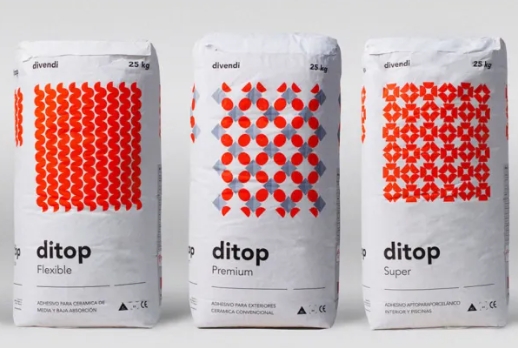
When it comes to packaging design, simplicity is key. One effective way to create striking packaging designs is by using just two colors.
Effective Color Choices
By limiting your color palette to two colors, you can create a cohesive and visually appealing design. Choose colors that complement each other and work well together to create a harmonious look.
Contrast is Key
Using two colors with high contrast can make your packaging design stand out and grab consumers’ attention. Opt for colors that are on opposite ends of the color wheel to create a dynamic and eye-catching design.
Focus on Typography
With just two colors, typography becomes even more important in your packaging design. Make sure your text is easily readable and complements the overall aesthetic of the design. Experiment with different fonts and sizes to create an interesting composition.
Embrace Minimalism
Two-color designs lend themselves well to a minimalist aesthetic. Embrace negative space and keep your design clean and uncluttered. This will help draw attention to the essential elements of your packaging.
Use Color Theory
Consider the psychological effects of the colors you choose for your packaging design. Different colors evoke different emotions and can influence consumers’ perceptions of your product. Use color theory to your advantage to create a design that resonates with your target audience.
Conclusion
The power of two colors in packaging design lies in its simplicity and effectiveness. By choosing the right colors, focusing on contrast and typography, embracing minimalism, and using color theory, you can create stunning packaging designs that make a lasting impression on consumers.