
Colgate is a renowned brand known for its oral care products that have been around for over two centuries.
1840s: The Beginning
In its early years, Colgate’s packaging design was simple and minimalistic, featuring the brand name and product information in black and white.
1920s: The Golden Age
During the Roaring Twenties, Colgate introduced vibrant colors and bold typography to capture the attention of consumers. Iconic red and white packaging became synonymous with the brand.
1950s: Modernization
As technology advanced, Colgate embraced modern design techniques and incorporated visuals of smiling faces and sparkling teeth on their packaging. The use of plastic containers also became popular during this time.
1980s: Innovation
Colgate revolutionized packaging design by introducing flip-top caps and squeezable tubes for their toothpaste products. This made it easier for consumers to use and store their oral care products.
2000s: Sustainability
In response to growing environmental concerns, Colgate shifted towards eco-friendly packaging materials such as recyclable plastics and cardboard. They also started using more minimalist designs to reduce waste.
Present Day: Digital Integration
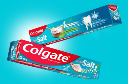
With the rise of e-commerce, Colgate has adapted its packaging design to cater to online shoppers. Eye-catching visuals and clear product information are crucial for standing out in a crowded digital marketplace.
Overall, Colgate’s packaging design has evolved significantly over the years to meet the changing needs and preferences of consumers. From simple black and white labels to eco-friendly materials and digital integration, the brand continues to innovate and stay relevant in the competitive oral care industry.